
[MIRAINOMAP] Making the Future of Local Governments Visible
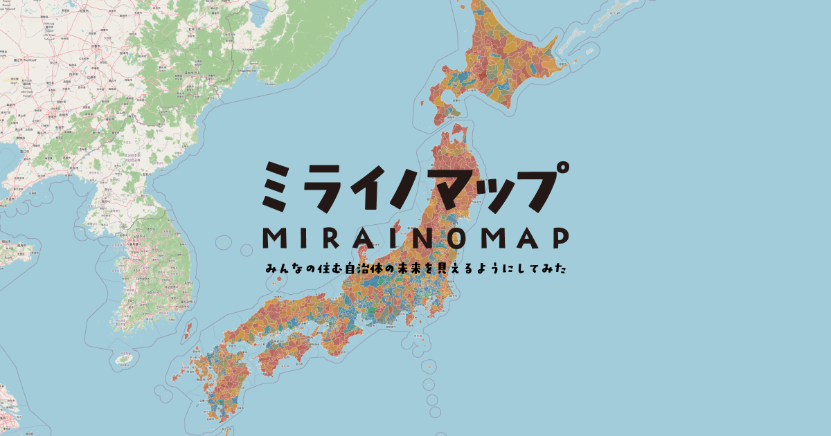
I launched MIRAINOMAP — in one line, “we tried to make the future of the places we live visible.” You can browse municipalities across Japan on a map and open a public-data scorecard for each one.
Public data exists — but it rarely reaches “my town”
Japan already publishes a lot of municipal numbers: fiscal soundness ratios, population projections, basic infrastructure and health-care figures. They are just hard to reach. Agency by agency, table by table, jargon by jargon — it is difficult to answer “what state is my town in, and what should I watch?”
Stories about “cities at risk of disappearing” draw attention, but they often lean on a narrow cut of indicators. MIRAINOMAP is closer to the opposite impulse: less hype, more relative comparison of present conditions and future headroom or risk, through a map and a scorecard.
Why “make it visible”
The goal is not a perfect ranking of winners and losers. It is to rearrange material that is already public into an entry point that starts from your own municipality. Think of it as a map and a chart sheet for orientation — not a specialist analytics suite.
Separate measured facts from future-weighted scores
Four design rules sit at the center:
- Stay with public data. Individual figures are measured official statistics. No homemade surveys or vibe-based rankings.
- Split “now” from “next.” Raw measurements stay as they are. The composite score and overall grade weigh fiscal and demographic foundations more heavily — the options a place still has. Convenience (transport, retail) thickens the scorecard but with a lighter weight. Rent is shown only as reference because variation inside one city is too large for a fair score.
- Don’t weaponize anxiety. Labels get plain-language glosses — not only “future burden ratio,” but “how large the debts still to be paid are.” Prefer relative wording (“comparatively stable / under more strain”) over verdict stickers.
- Start from your town. National map → pick a municipality → strengths, watch-outs, field scores, similar places. You should not need domain expertise to begin.
The map’s colors for individual metrics follow measured data. The composite color and grade are explicitly a future-risk-weighted blend. Measured numbers stay measured; the overall score is a synthesis that leans into tomorrow.
What the fields cover
| Field | What it looks at |
|---|---|
| Finance | Debt load, annual repayment, spending flexibility, reserves |
| Population | Likely change, working-age vs. aging balance |
| Infrastructure | Water/sewer durability, investment signals for roads and facilities |
| Health care | Rough depth of doctors and beds |
| Daily life | Rail stations, retail convenience (rent excluded) |
Each scorecard highlights strengths and caution metrics versus the national distribution, a radar by field, and municipalities with similar scores.
What we deliberately left out
- Rent stays out of the score — station-adjacent and suburban prices diverge; “cheap” is not the same as “easy to live.”
- Convenience is not the star of the composite — useful, but this product’s focus is fiscal and demographic headroom.
- No doom ranking tone — relative comparison and gentle alerts, not a tool for condemning governments.
- No single “correct town” — similar places are shown side by side instead of collapsing everything into one leaderboard.
The line is simple: not to inflate fear, but to make comparison possible.
Who it’s for
People who want their town’s numbers in one place instead of news fragments. Anyone needing a starter sheet for moving, returning home, or local discussion. Journalists, municipal staff, and researchers who want a first overview before diving deeper.
How it relates to The Street Archive / MACHIDORI
On The Street Archive | MACHIDORI YouTube channel and this site, I have been archiving station fronts, shopping streets, and nightlife districts in regional Japanese cities — 4K walking video plus blog posts that fill in maps, access notes, and what the street looked like that night. The archive map on this site is for following those filmed routes.
What the walking videos convey, though, is only the city’s public face. Flash at the station front, a brighter image after redevelopment, the convenience you can see on foot — none of that necessarily matches fiscal health or future headroom. Behind tidy sidewalks and new facades, the polish may rest on municipal investment financed less by reserves than by local bonds and other borrowing. Video alone cannot show that underside.
The reverse is also true. A place that looks dull or hollowed-out at first glance may simply be the face of steady, unshowy management — less front-loaded spending, more caution. Street buzz and fiscal–demographic foundations sit on different axes. That gap is one reason MIRAINOMAP exists: against the surface a city presents, I wanted public data to surface the quieter side — finances first among them, and the other challenges municipalities carry.
Walking still tells you atmosphere: how quiet the center feels, whether bars are still lit, where construction blocks the sidewalk. It does not show population outlooks or debt load. News fragments and broad “city at risk” headlines also make it hard to see where one town sits relative to others.
MIRAINOMAP comes from the same habit of looking at regional Japan, but as another layer. Street work records how a street feels right now; the municipal map lines up measured indicators and a future-weighted composite from public data. You can open a scorecard for places walked on this blog — Kushiro, Obihiro, and others — without treating either project as a substitute for the other. Video and essays show the face; structured comparison shows more of what sits behind it.
If a municipality comes to mind, open it on mirainomap.jp.
Related Posts
Browse the archive map
Explore street videos from cities across Japan on the map.
Open map![[Obihiro / Kita no Yatai] Walking the Night District — Station Dining Streets and Bar Alleys](/images/2026/09/22/1/20260922_1_7.jpg)
![[Kushiro / Suehiro] Walking the Night District — Station Streets and Bar Alleys](/images/2026/09/21/1/20260921_1_12.jpg)
![[Keisei Tsudanuma] Night Walk | Quiet Arcade and Station Crossing](/images/2026/09/11/1/20260911_1_3.jpg)